How to Pick a Flower Color Palette
Sep 27
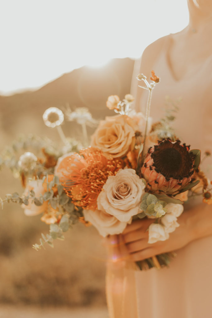
Design details will have a great impact on the feeling and style of your big day. A key design detail is your color palette. Color is so powerful to communicate a message. It can influence us without us even noticing. What do you want the feeling and style of your event to be? With that decision in mind, then consider what will influence those details. A huge influence? Color!
I am sharing some tips on how to decide on a flower color palette. Now don’t feel like you have to print a color wheel and endlessly Google flower names. I’ve got your back there! This serves to introduce you to the fun adventure of picking a flower color palette. And I look forward to joining you on it no matter where you find yourself!
Starting Place
It can be as simple as beginning with an image or place or thing you love and launching your design style, including color, based on that inspiration. Some ideas to spark inspiration are:
-Embrace the natural color palette of the season your wedding is in.
-Use a key color in mind that you’ve just had your heart set on as a launching pad.
-Incorporate a specific design element you are using as your key inspiration element.
-Use a favorite flower that is a specific color.
-Find inspiration from a key design element you would love to include in your wedding that leans towards a certain color palette.
-Think about the experience you want your guests to have. Does a specific color speak that feeling to you?
Choose a Primary Color to Expand On
After considering something from the list above, or another source of inspiration, decide on a primary color. You could even choose more than one to explore a full color palette with, so that you’ll have two options in the end. You have now accomplished the first step, way to go!
Pairing Other Colors with the Primary Color
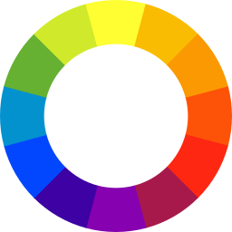
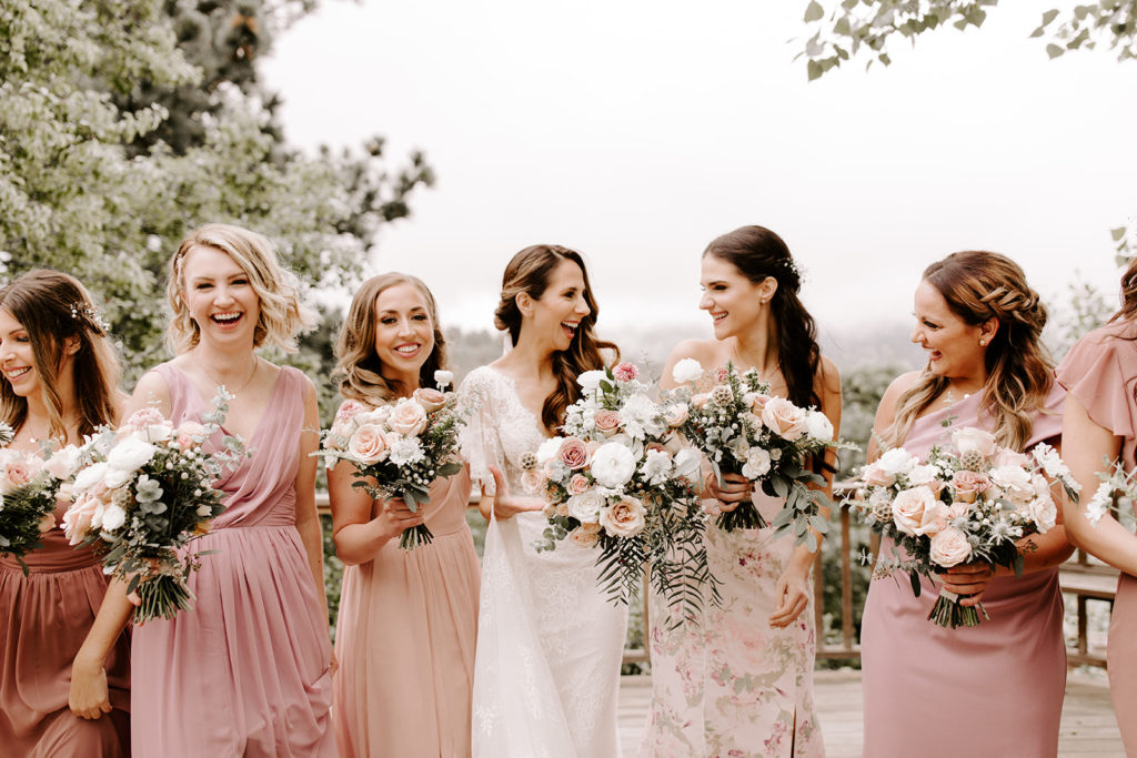
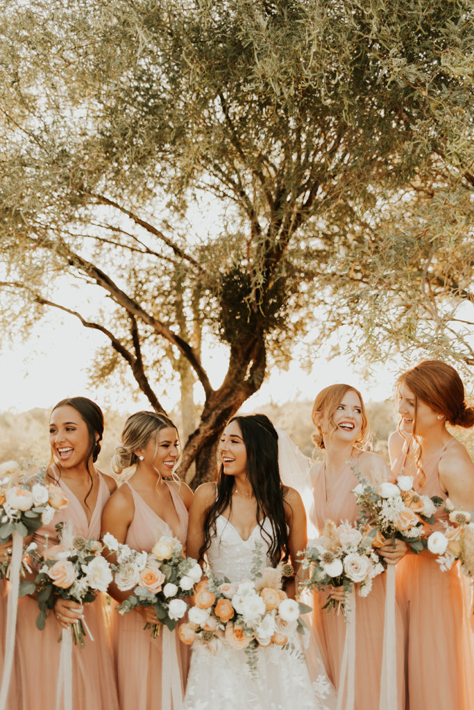
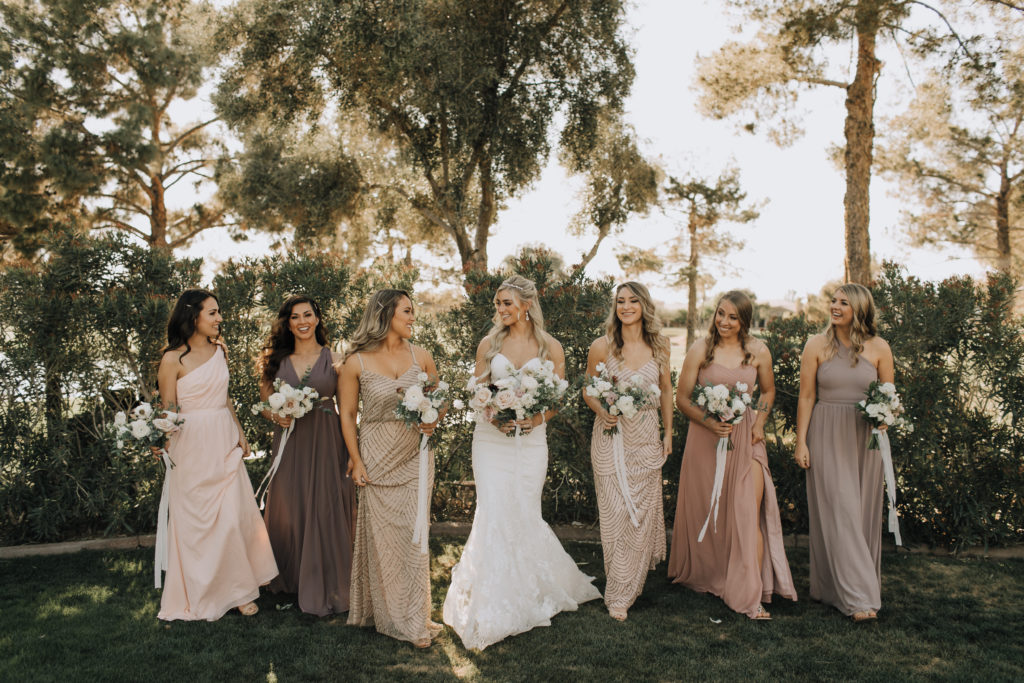
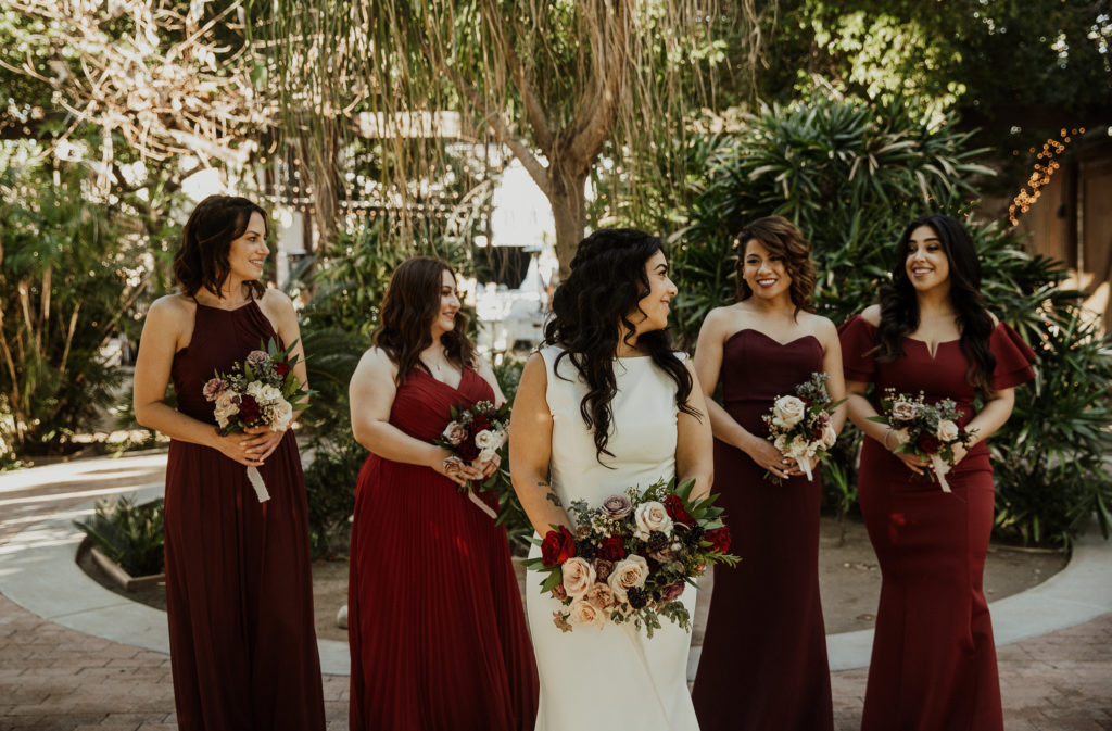
No matter the color you have chosen from your inspiration, you can have a high contrast palette or a more harmonious palette. Considering the color wheel, a high contrast palette is accomplished by choosing an opposite color from the primary color on the wheel as a key color in the palette. I would suggest bridging the gap between the two colors with hints of the colors in between to fade the contrast together. For a harmonious palette, choose colors to the right and left of your primary color on the color wheel. A sophisticated and timeless design is often achieved by exploring just one section of the color wheel.
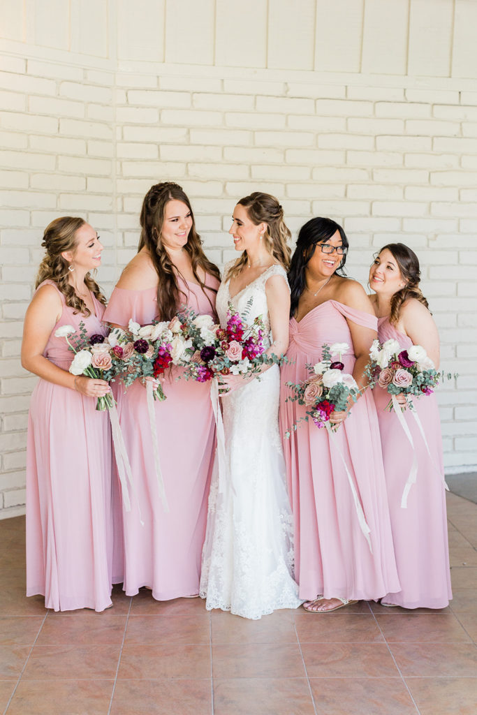
Color saturation is a fancy word for the intensity of a color. Unless the occasion is right, I would recommend avoiding highly saturated colors for most designs. Keeping the level of saturation consistent is most pleasing to the eye, again in most cases.
What about Greenery?
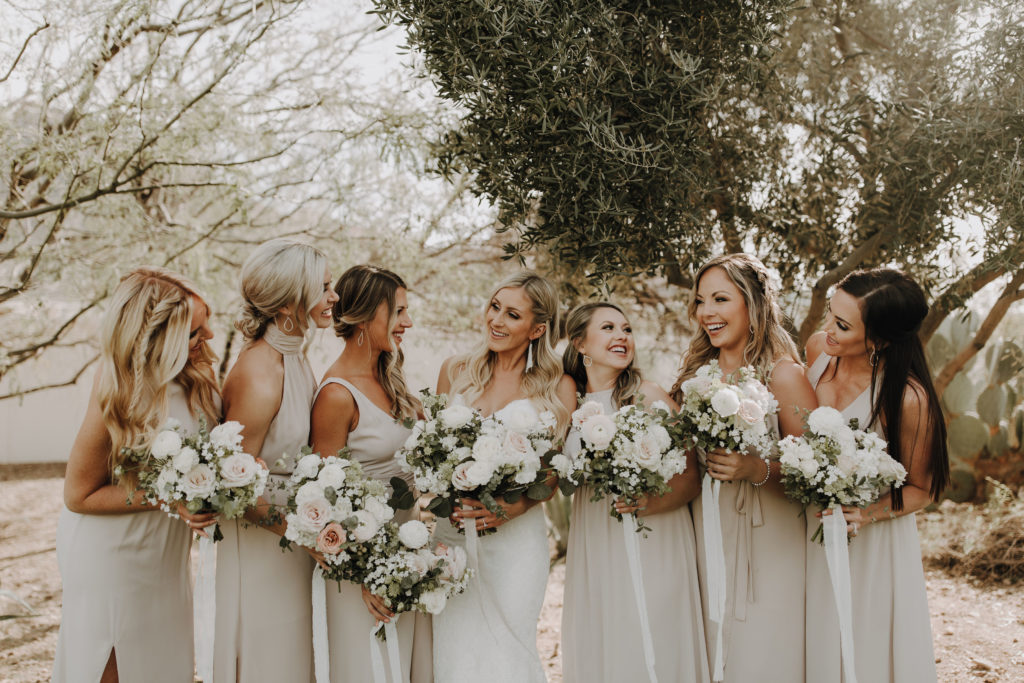
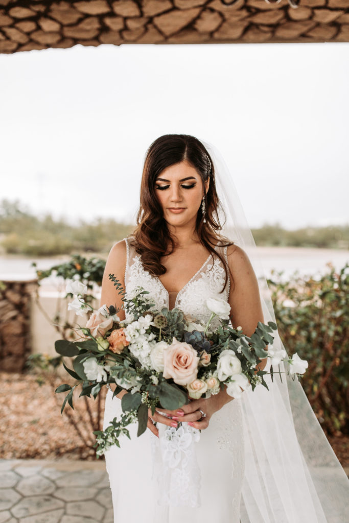
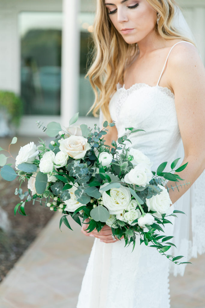
In case you haven’t noticed, I am a fan of greenery. Although it is a color, you don’t have to consider it in your color wheel analyzing. It’s neutral! The support system to your palette. Honestly, it goes with anything.
I’d love to chat about colors before you make a final decision for your big day. I think this is an important detail that gets overlooked. There is so much possible within a color palette to make it your own. No doubt there are tried and true palettes that are beautiful and you can definitely find awesome suggestions online for palettes. But don’t be afraid to be inspired and let yourself take a color adventure to arrive at a palette perfectly unique to you! if you are up for making a bit of a statement, let’s dream something up that is all your own.
leave one here!
comments